How to scale aside and div center according to screen height

Asked

Viewed 1,154 times

1

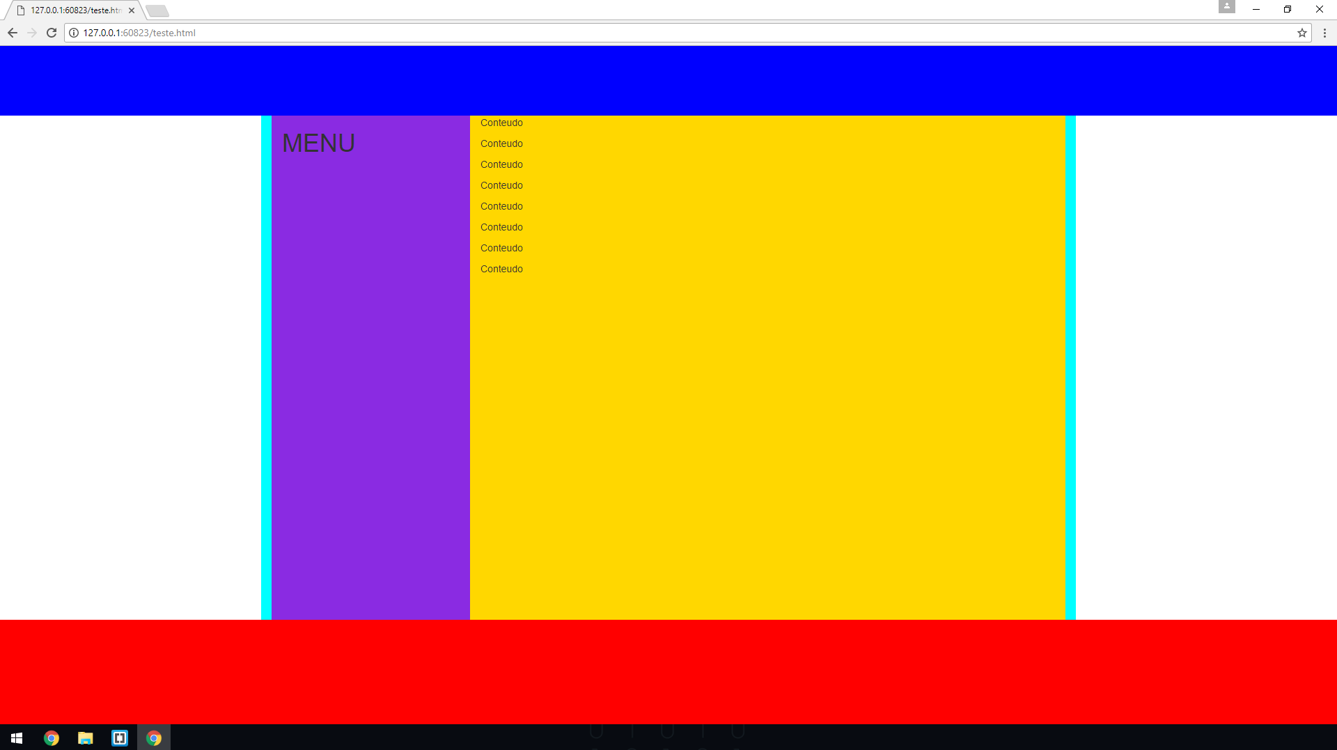
I’m trying to scale the side menu and the content div between the header and the footer so that it occupies the entire screen, even if I don’t have much content. if you have a lot of content, you would have the scroll bar.
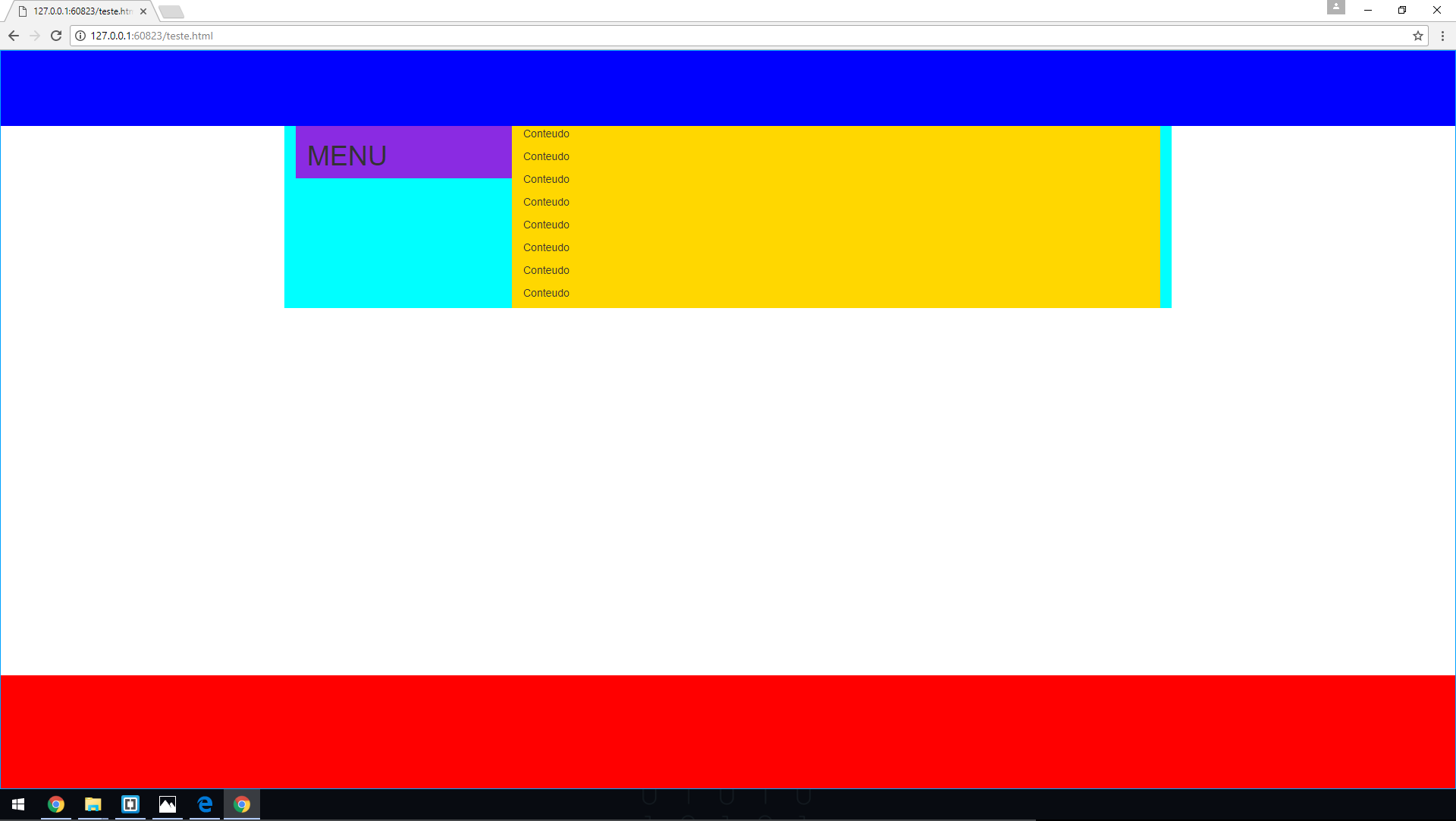
Like this:

inserir a descrição da imagem aqui

How it should be (Photoshop):

inserir a descrição da imagem aqui

Code:

<!DOCTYPE html>
<html>
<head>
    <meta charset="utf-8">
    <meta name="viewport" content="width=device-width, initial-scale=1">
    <link rel="stylesheet" href="https://maxcdn.bootstrapcdn.com/bootstrap/3.3.7/css/bootstrap.min.css">
    <script src="https://ajax.googleapis.com/ajax/libs/jquery/3.2.1/jquery.min.js"></script>
    <script src="https://maxcdn.bootstrapcdn.com/bootstrap/3.3.7/js/bootstrap.min.js"></script>

    <style>
        html,body{
            min-height: 100%;  
        }

        header {
            height: 100px;
            background-color: blue;
        }

        .container {
            background-color: aqua;
        }

        aside {
            background-color: blueviolet;
            height: 100%;
        }

        main {
            background-color: gold;
            height: 100%;
        }

        footer {
            height: 150px;
            background-color: red;
            position: absolute;
            bottom: 0;
            width: 100%;
        }
    </style>
</head>

<body>
    <header>
    </header>

    <div class="container">
        <aside class="col-sm-3">
            <h1>MENU</h1>
        </aside>

        <main class="col-sm-9">
            <p>Conteudo</p>
            <p>Conteudo</p>
            <p>Conteudo</p>
            <p>Conteudo</p>
            <p>Conteudo</p>
            <p>Conteudo</p>
            <p>Conteudo</p>
            <p>Conteudo</p>
        </main>
    </div>

    <footer>
    </footer>
</body>
</html>

3 answers

1

Should give height value either in 100% or in 100vh this to have a responsive site following the example can also see this as it helps with formatting Link Google

html, body, 
    margin: 0;
    padding:0;
    width: 100%;
    height: 100vh;

}

1

To keep the div until the end of the page just add in the given element.

.elemento
{
   height: 100vh;
}

0

For a div to be 100% tall, your parents also need to be 100%. Follow the code:

<style>
    html,body{
        height: 100%;  
    }

    header {
        height: 100px;
        background-color: blue;
    }

    .container {
        background-color: aqua;
        height: 100%; 
    }

    aside {
        background-color: blueviolet;
        height: 100%;
    }

    main {
        background-color: gold;
        height: 100%;
    }

    footer {
        height: 150px;
        background-color: red;
        position: relative;
        bottom: 0;
        width: 100%;
    }
</style>

Browser other questions tagged

You are not signed in. Login or sign up in order to post.