Very limited, but still, only with CSS, just use two titles and position a little more to one side, it is important that one of them is on top with a smaller height and white background
h2[cortado], h2[cortado]::before {
    padding-left: 5px;
    font-family: sans-serif;
    font-weight: 100;
    font-size: 3rem;
    letter-spacing: .25em;
    text-transform: uppercase;
    position: absolute;
    top: 0;
    left: 0;
}
h2[cortado] {
    z-index: 2;
}
h2[cortado]::before {
    content: attr(cortado);
    transform: translateX(3.5px);
    height: 30px;
    background-color: white;
    overflow: hidden;
    z-index: 2;
}
<h2 cortado="cortado">cortado</h2>
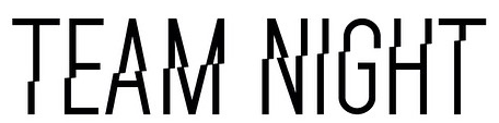
Only with the attribute without having to repeat in HTML using ::after and ::before, you can also use the edge and the inner edge to give a distance effect between the bottom and top
h2[cortado]::after, h2[cortado]::before {
    padding-left: 3.5px;
    font-family: sans-serif;
    font-weight: 100;
    font-size: 3rem;
    letter-spacing: .25em;
    text-transform: uppercase;
    position: absolute;
    top: 0;
    left: 0;
    content: attr(cortado);
}
h2[cortado]::after {
    z-index: 1;
}
h2[cortado]::before {
    transform: translateX(3.5px);
    height: 25px;
    background-color: white;
    overflow: hidden;
    z-index: 2;
    border-bottom: 3px solid white;
    padding-bottom: 3px;
}
<h2 cortado="exemplo"></h2>

tried to use the
::beforerotating with a white background, to have the diagonal effect, but without success– Costamilam
Face diagonally is a detail, using the attr() of the pseudo element became pretty cool!
– hugocsl
Is not a
clip-pathbut better than nothing– Costamilam
I added another example, just with
attr, without having to repeat the word, and with a spacing between the parts– Costamilam
Very good young man! Already this getting beast! If gave I enjoyed again =)
– hugocsl