2
I’m following the tutorial on w3school, he is inserting the items, one below the other and not on the side (inline) !
According to my code it should be on each other’s side:
CSS
* {
    box-sizing: border-box;
}

.grid-container {
    display: grid;
    grid-template-columns: auto auto auto auto auto auto auto auto auto auto auto auto;
    grid-gap: auto;
    background-color: #2196F3;
    padding: 0.5%;
}

.grid-row::after {
    content: "";
    clear: both;
    display: table;
}


/* Extra small devices (phones, 600px and down) */
@media only screen and (max-width: 600px) {
    .col-esm-1  {  width: 8.33%;   }
    .col-esm-2  {  width: 16.66%;  }
    .col-esm-3  {  width: 25%;  }
    .col-esm-4  {  width: 33.33%;  }
    .col-esm-5  {  width: 41.66%;  }
    .col-esm-6  {  width: 50%;  }
    .col-esm-7  {  width: 58.33%;  }
    .col-esm-8  {  width: 66.66%;  }
    .col-esm-9  {  width: 75%;  }
    .col-esm-10 {  width: 83.33%;  }
    .col-esm-11 {  width: 91.66%;  }
    .col-esm-12 {  width: 100%;  }
}

/* Small devices (portrait tablets and large phones, 600px and up) */
@media only screen and (min-width: 600px) {
    .col-sm-1   {  width: 8.33%;   }
    .col-sm-2   {  width: 16.66%;  }
    .col-sm-3   {  width: 25%;  }
    .col-sm-4   {  width: 33.33%;  }
    .col-sm-5   {  width: 41.66%;  }
    .col-sm-6   {  width: 50%;  }
    .col-sm-7   {  width: 58.33%;  }
    .col-sm-8   {  width: 66.66%;  }
    .col-sm-9   {  width: 75%;  }
    .col-sm-10  {  width: 83.33%;  }
    .col-sm-11  {  width: 91.66%;  }
    .col-sm-12  {  width: 100%;  }
}

/* Medium devices (landscape tablets, 768px and up) */
@media only screen and (min-width: 768px) {
    .col-md-1   {  width: 8.33%;   }
    .col-md-2   {  width: 16.66%;  }
    .col-md-3   {  width: 25%;  }
    .col-md-4   {  width: 33.33%;  }
    .col-md-5   {  width: 41.66%;  }
    .col-md-6   {  width: 50%;  }
    .col-md-7   {  width: 58.33%;  }
    .col-md-8   {  width: 66.66%;  }
    .col-md-9   {  width: 75%;  }
    .col-md-10  {  width: 83.33%;  }
    .col-md-11  {  width: 91.66%;  }
    .col-md-12  {  width: 100%;  }
}

/* Large devices (laptops/desktops, 992px and up) */
@media only screen and (min-width: 992px) {
    .col-lg-1   {  width: 8.33%;   }
    .col-lg-2   {  width: 16.66%;  }
    .col-lg-3   {  width: 25%;  }
    .col-lg-4   {  width: 33.33%;  }
    .col-lg-5   {  width: 41.66%;  }
    .col-lg-6   {  width: 50%;  }
    .col-lg-7   {  width: 58.33%;  }
    .col-lg-8   {  width: 66.66%;  }
    .col-lg-9   {  width: 75%;  }
    .col-lg-10  {  width: 83.33%;  }
    .col-lg-11  {  width: 91.66%;  }
    .col-lg-12  {  width: 100%;  }
}

/* Extra large devices (large laptops and desktops, 1200px and up) */
@media only screen and (min-width: 1200px) {
    .col-elg-1  {  width: 8.33%;   }
    .col-elg-2  {  width: 16.66%;  }
    .col-elg-3  {  width: 25%;  }
    .col-elg-4  {  width: 33.33%;  }
    .col-elg-5  {  width: 41.66%;  }
    .col-elg-6  {  width: 50%;  }
    .col-elg-7  {  width: 58.33%;  }
    .col-elg-8  {  width: 66.66%;  }
    .col-elg-9  {  width: 75%;  }
    .col-elg-10 {  width: 83.33%;  }
    .col-elg-11 {  width: 91.66%;  }
    .col-elg-12 {  width: 100%;  }
}
HTML:
<!DOCTYPE html>
<html lang="en">
<head>
    <meta charset="UTF-8">
    <meta name="viewport" content="width=device-width, initial-scale=1.0">
    <meta http-equiv="X-UA-Compatible" content="ie=edge">
    <link rel="stylesheet" href="css/grid-system.css">
    <title></title>
</head>
<body>
    <div class="grid-container">
        <div class="grid-row">

                <div class="col-elg-3" style="background-color: red">1</div>
                <div class="col-elg-3" style="background-color: red">2</div>
                <div class="col-elg-3" style="background-color: red">3</div>
                <div class="col-elg-3" style="background-color: red;">4</div>


        </div>

    </div>

</body>
</html>
Which object of this code did you add? because I didn’t find any "repeat" in W3 referring to this.. And another, I did it in the right way?
– user109930
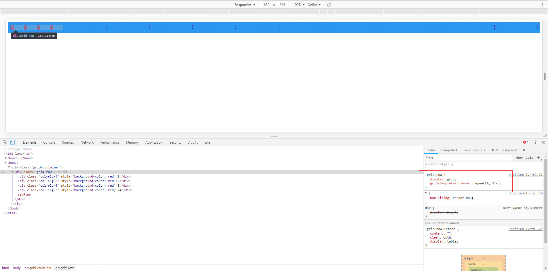
@THIAGOSAAD the repeat() means that vc will repeat the grid size, so instead of vc write 12 time auto, auto, auto... vc can only write repeat(12, 1fr). In the case how vc had 4 col-Elg-3 I repeated repeat(4, 1fr). This means that are 4 ranges of equal size. But I don’t know exactly what you want with the grid, the way you mounted the Divs in html got a little strange, pq is a Grid inside another notice the image I posted that has a Gride of 12 columns, but in the first cell has another grid with 4 columns with the red boxes.
– hugocsl
@THIAGOSAAD notice that if you delete the div
<div class="grid-row">Your Grid will fit into the main Grid, and the Divs will be on the same line. In General I found this CSS half stretch, it seems that is mixing a Flex Grid with a Grid Template. However I hope the answer helps– hugocsl
so my goal is to learn how the frameworks work, the bootstrap for example. You have some material for me to learn the right way?
– user109930
@THIAGOSAAD you are already on the right track which is to read, test, err and correct. I’m old school, so I like to read the documentation of things to understand how they work. My tip about Bootstrap is that you read and reread the documentation, but for that it would be interesting to know the fundamentals of CSS. With that regardless of Framwark you’ll always know what you’re doing and not just copying and pasting things. Then knowing the fundamentals of the display:flex will help you a lot to understand the BS Grid for example. Study the fundamentals of CSS, youtube has A lot of material in English and English
– hugocsl
Change the nick to "Hugocss" rs...
– Sam
@dvd is just to exchange the L for an S had never noticed :D. Now I’m already seeing some JS classes, just very basic thing, understanding what is var, array, object, function etc. I want to end the year answering some JS questions too! Sometimes I keep reading a JS answer to see if I’ve already picked up something, only I think I’ll have to study programming logic before going into it. It was worth the force dvd!
– hugocsl
That’s right, boy! I’m rooting for your ass!
– Sam