2
the feat is found on that website https://www.canva.com/ is the effect of the main screen before logging in. Since already grateful. :)
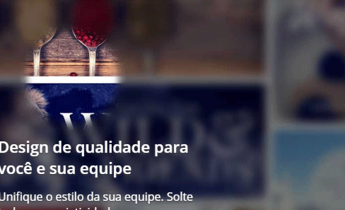
2
the feat is found on that website https://www.canva.com/ is the effect of the main screen before logging in. Since already grateful. :)
4
I made a simplified version, but sometimes it can suit you. It uses jQuery with a very basic function just to make an element follow the mouse.
This element that follows the mouse that has a CSS to do the Spot Light effect showing the image below. I needed to use filtros and bland-modes, so it doesn’t work in qq browser.
As I said is a simplified version, but follow the example.
$(document).mousemove(function(e){
    $('.bola').css({left:e.pageX, top:e.pageY});
})
html, body {
width: 100%;
height: 100%;
margin: 0;
overflow: hidden;
}
.bg {
position: absolute;
top: 0;
left: 0;
width: 100%;
height: 100%;
margin: 0;
background-image: linear-gradient(to left, rgba(0,0,0,0.75), rgba(0,0,0,0.75)), url(https://rharrington1992.files.wordpress.com/2012/10/a3-two11.jpg);
background-size: cover;
background-repeat: no-repeat;
filter: saturate(2);
}
.bola {
width: 150px;
height: 150px;
border-radius: 50%;
background: rgba(255,255,255,0.2);
filter: blur(10px);
position: absolute;
transform: translate(-50%, -50%);
mix-blend-mode: soft-light;
pointer-events: none;
transition: 200ms;
}
.bola1 {
transition: 100ms;
}
.bola2 {
transition: 150ms;
}
.bola3 {
transition: 200ms;
}
.bola4 {
transition: 250ms;
}
.bola5 {
transition: 300ms;
}<script src="https://code.jquery.com/jquery-3.3.1.js"></script>
<!-- o jQuery é apenas para fazer a bola acompanhar o mouse -->
<div class="bg"></div>
<div class="trilha">
<div class="bola bola1"></div>
<div class="bola bola2"></div>
<div class="bola bola3"></div>
<div class="bola bola4"></div>
<div class="bola bola5"></div>
</div> The principle is the same, but no . ball has a backgrount-attachmente:fixed with the same bg of the fund that has the Blur, then where the mouse passes the background loses the blur and gains color.
$(document).mousemove(function(e){
      $('.bola').css({left:e.pageX, top:e.pageY});
})
html, body {
width: 100%;
height: 100%;
margin: 0;
overflow: hidden;
}
.bg1 {
position: absolute;
width: 100%;
height: 100%;
top: 0;
left: 0;
background-image:linear-gradient(to left, rgba(0,0,0,0.75), rgba(0,0,0,0.75)), url(https://rharrington1992.files.wordpress.com/2012/10/a3-two11.jpg);
background-size: cover;
background-repeat: no-repeat;
filter: blur(3px) grayscale(100%);
}
.bola {
width: 200px;
height: 200px;
border-radius: 50%;
background-color: rgba(255,255,255,0.2);
background-image: url(https://rharrington1992.files.wordpress.com/2012/10/a3-two11.jpg);
background-attachment: fixed;
background-repeat: no-repeat;
background-size: 100%;
filter: blur(0px);
position: absolute;
transform: translate(-50%, -50%);
mix-blend-mode: soft-light;
pointer-events: none;
transition: 200ms;
background-position-y: 100px;
background-position-x: 100px;
}
.bola1, .bola2, .bola3 {
transition: 100ms;
}<script src="https://code.jquery.com/jquery-3.3.1.js"></script>
<div class="bg1"></div>
<div class="trilha">
<div class="bola bola1"></div>
<div class="bola bola2"></div>
<div class="bola bola3"></div>
</div> 4
You can use a plugin (see Javascript below) that does this effect using canvas.
Create a div where it will have the "dark blurred" background (in the example is the div with class .dark). In the plugin, where canvas is created with the class .blurlayer, put the image path "clear and sharp" (see comment in code).
In CSS both classes (.dark and .blurlayer) should have the styles:
.blurlayer{
   position:absolute;
   left:0;
   top:0;
   z-index: -1;
}

.dark{
   position: absolute;
   top: 0;
   left: 0;
   width: 100%;
   height: 100%;
   background-color:#3f4652;
   background-image:url(https://static.canva.com/static/images/bg_tiles.2.jpg); /*imagem escura*/
   background-size:cover;
   z-index: -1;
}
You can apply the effect on body all or only parts of the page you want, just make the necessary adjustments. The example below shows the effect applied to body whole:
(function() {
   var x=new r;
   function r(){}
   r.prototype.setInterval=function(a,b){
      return window.setInterval(a,b)
   }

   r.prototype.clearInterval=function(a){
      window.clearInterval(a)
   }

   r.prototype.setTimeout=function(a,b){
      return window.setTimeout(a,b)
   }

   r.prototype.clearTimeout=function(a){
      window.clearTimeout(a)
   }

   r.prototype.requestAnimationFrame=function(a){
      return window.requestAnimationFrame(a)
   }

   r.prototype.cancelAnimationFrame=function(a){
      window.cancelAnimationFrame(a)
   }

   function y(){
      var a=$("body");
      function b(){
         a.mousemove(function(c){
            p=c.clientX;
            t=c.clientY;
            w=Date.now();
            u||n()
         });

         $(window).on("blur mouseout",function(){
            t=p=null
         })
         .on("resize",function(){
            d&&d.parentNode&&d.parentNode.removeChild(d);
            q()
         });
         q()
      }

      function q(){
         var c,b;
         h();
         c=a.width();
         b=a.height();
         d=document.createElement("canvas");
         d.className="blurlayer";
         d.width=c;
         d.height=b;
         a.append(d);
         l=document.createElement("canvas");
         l.width=c;
         l.height=b;
         if(d.getContext&&d.getContext("2d")&&(m=d.getContext("2d"),
         f=l.getContext("2d"),
         f.lineCap="round",
         f.shadowColor="#000000",
         f.shadowBlur=-1<navigator.userAgent.indexOf("Firefox")?0:30,!g)){
            g=new Image();
            if(!a.css("background-image")) throw Error("element must have a background image");
            $(g).one("load",n);
            // imagem clara
            $(g).attr("src","https://static.canva.com/static/images/bg_tiles_color.2.jpg");
         }
      }

      function h(){
         v=[];
         $(".js-blurEffect--skip").each(function(c,a){
            var d;
            d=$(a);
            d.is(":visible")&&(c=d.position(),
            a=d.outerWidth(),
            d=d.outerHeight(),
            v.push({
               top:c.top,
               left:c.left,
               width:a,
               height:d
            })
         )}
      )}

      function n(){
         var c, b=Date.now();
         c=a.scrollTop();
         u=b>w+500?!1:!0;
         p&&u&&e.unshift({
            time:b,x:p,y:t+c
         });
         for(c=0;c<e.length;)
         1E3<b-e[c].time?e.length=c:c++;
         0<e.length&&x.requestAnimationFrame(n);
         f.clearRect(0,0,l.width,l.height);
         for(c=1;c<e.length;c++){
            var h=Math.sqrt(Math.pow(e[c].x-e[c-1].x,2)+Math.pow(e[c].y-e[c-1].y,2));
            f.strokeStyle="rgba(0,0,0,"+Math.max(1-(b-e[c].time)/1E3,0)+")";
            f.lineWidth=25+75*Math.max(1-h/50,0);
            f.beginPath();
            f.moveTo(e[c-1].x,e[c-1].y);
            f.lineTo(e[c].x,e[c].y);
            f.stroke()
         }
         b=d.width;
         c=d.width/g.naturalWidth*g.naturalHeight;
         c<d.height&&(c=d.height,b=d.height/g.naturalHeight*g.naturalWidth);
         m.drawImage(g,0,0,b,c);
         m.globalCompositeOperation="destination-in";
         m.drawImage(l,0,0);
         m.globalCompositeOperation="source-over";
         v.forEach(function(c){
            m.clearRect(c.left,c.top,c.width,c.height)
         })
      }
      var d,l,m,f,g,p=null,t=null,e=[],w=0,u=!0,v=[];
      "createTouch" in document||$(b)
   }

   $(function(){
      y()
   });
})();
html, body{
margin: 0;
height: 100%;
}
.blurlayer{
position:absolute;
left:0;
top:0;
z-index: -1;
}
.dark{
position: absolute;
top: 0;
left: 0;
width: 100%;
height: 100%;
background-color:#3f4652;
background-image:url(https://static.canva.com/static/images/bg_tiles.2.jpg); /*imagem escura*/
background-size:cover;
z-index: -1;
}<script src="https://ajax.googleapis.com/ajax/libs/jquery/2.1.1/jquery.min.js"></script>
<div class="dark"></div>You can also add the class
.darkon the tagbody, that is not so need to create thediv .dark, but then it is necessary to remove thez-index,position,topandleftclass.
Browser other questions tagged css
You are not signed in. Login or sign up in order to post.
take a look at the interaction of the Blur effect on . CSS with Jquery.
– Thales Augusto
If you need help in the implementation can call me.
– Sam