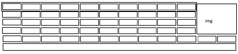
To solve vc you can group the first 4 Rows in a container. In case mine I called Wrapper as you will see in CSS. Then I used the class .col2 to define the behavior of the image that is actually the background of a col-xs-2 that has position:absolut and height de 100% to always be the height of the Wrapper. This means that if you want 8 rows inside the Wrapper the image still occupies the whole height!
OBS 1: The styles I used in [class^=col-] are just so you can view the Grid format. Already the classer . wrapper and . col2 vc will need!
OBS2: I placed the entire Grid within the default Bootstrap class .container, but if you want the Grid occupy 100% of the screen width just remove the div.container okay.
[class^=col-] {
    padding-top: 10px;
    padding-bottom: 10px;
    background-color: #eee;
    background-color: rgba(86,61,124,.15);
    border: 1px solid #ddd;
    border: 1px solid rgba(86,61,124,.2);
    box-sizing: border-box;
}
.wrapper {
    position: relative;
    box-sizing: border-box;
    margin: 0 -15px;
    padding: 0 15px;
}
.col2 {
    position: absolute !important;
    right: 0;
    height: 100%;
    background-image: url(http://placecage.com/200/200);
    background-size: cover;
    background-position: center;
}
<link rel="stylesheet" href="https://maxcdn.bootstrapcdn.com/bootstrap/3.3.7/css/bootstrap.min.css" >

<div class="container">
    <div class="wrapper">
        <div class="row">
            <div class="col-xs-1">.col-xs-1</div>
            <div class="col-xs-1">.col-xs-1</div>
            <div class="col-xs-1">.col-xs-1</div>
            <div class="col-xs-1">.col-xs-1</div>
            <div class="col-xs-1">.col-xs-1</div>
            <div class="col-xs-1">.col-xs-1</div>
            <div class="col-xs-1">.col-xs-1</div>
            <div class="col-xs-1">.col-xs-1</div>
            <div class="col-xs-1">.col-xs-1</div>
            <div class="col-xs-1">.col-xs-1</div>
            <div class="col-xs-2 col2">.col-xs-2</div>
        </div>
        <div class="row">
            <div class="col-xs-1">.col-xs-1</div>
            <div class="col-xs-1">.col-xs-1</div>
            <div class="col-xs-1">.col-xs-1</div>
            <div class="col-xs-1">.col-xs-1</div>
            <div class="col-xs-1">.col-xs-1</div>
            <div class="col-xs-1">.col-xs-1</div>
            <div class="col-xs-1">.col-xs-1</div>
            <div class="col-xs-1">.col-xs-1</div>
            <div class="col-xs-1">.col-xs-1</div>
            <div class="col-xs-1">.col-xs-1</div>
        </div>
    </div>
    <div class="row">
        <div class="col-xs-1">.col-xs-1</div>
        <div class="col-xs-1">.col-xs-1</div>
        <div class="col-xs-1">.col-xs-1</div>
        <div class="col-xs-1">.col-xs-1</div>
        <div class="col-xs-1">.col-xs-1</div>
        <div class="col-xs-1">.col-xs-1</div>
        <div class="col-xs-1">.col-xs-1</div>
        <div class="col-xs-1">.col-xs-1</div>
        <div class="col-xs-1">.col-xs-1</div>
        <div class="col-xs-1">.col-xs-1</div>
        <div class="col-xs-1">.col-xs-1</div>
        <div class="col-xs-1">.col-xs-1</div>
    </div>
    <div class="row">
        <div class="col-xs-12">.col-xs-12</div>
    </div>
</div>
And how did you try? Could [Edit] the question and add the code?
– Woss
You are using Bootstrap 3 or want in version 4?
– hugocsl
To using Bootstrap 3
– hard123
Front edits your question and puts more details for it to be voted to be reopened ok. I already have an answer for you using only the Bootstrap 3 Grid, but as long as the question is closed I can’t post the answer. Try to edit it with the grid you tried to make a better explanation than I put the answer to you. [] s
– hugocsl
@hugocsl edited the question with more information.
– hard123
Cool, I voted to reopen, let’s see if she comes back, then put the code for you. But if you want to go trying, you have to do a div on the outside that encapsulates the first 4 Rows, then with css you will bring the col of the image. No need to table!
– hugocsl