2
People have difficulty leaving the Name and Subject side by side , simply will not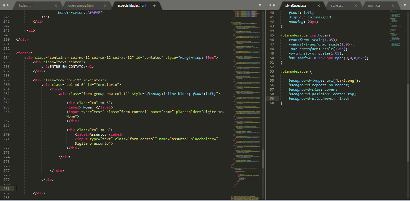
2
People have difficulty leaving the Name and Subject side by side , simply will not
2
For you to put the label next to the input you have to use the form tag this way <form class="form-horizontal"> this is the model of the official documentation.
Documentation of .form-horizontal: https://getbootstrap.com/docs/3.3/css/#Forms-horizontal
See the example with your code using the official BS3 standard
<link rel="stylesheet" type="text/css" media="screen" href="https://maxcdn.bootstrapcdn.com/bootstrap/3.3.7/css/bootstrap.min.css" />
<footer>
        <div class="container col-md-12 col-sm-12 col-xs-12" id="contatos" style="margin-top: 60px">
            <div class="text-center">
                <h2>ENTRE EM CONTATO</h2>
            </div>

            <div class="row" id="infos">
                <div class="col-xs-12" id="formulario">
                    <form class="form-horizontal">
                        <div class="form-group">
                            <label class="col-xs-2 control-label">Nome: </label>
                            <div class="col-xs-10">
                                <input type="text" class="form-control" name="nome" placeholder="Digite seu Nome">
                            </div>
                        </div>
                        <div class="form-group">
                            <label class="col-xs-2 control-label">Assunto: </label>
                            <div class="col-xs-10">
                                <input type="text" class="form-control" name="assunto" placeholder="Digite o assunto">
                            </div>
                        </div>
                    </form>
                </div>
            </div>
        </div>
</footer>1
Hello, Bruno!
Well, I’ll try to explain to you how the Bootstrap GRID works:
You stated right, but each col has its proportion, the sequence is like this;
I tried to summarize for better understanding, what you can do so that the same column be responsive on mobile or tablet, is to mix the sizes, for example:
<div class="col-sm-4 col-md-4">
   conteúdo
</div>
Of course this, as per your need, the only problem is that you are uniting col,Row and container all in the same statement, and that’s one per line ,now the structure would look like this:
<div class="container">
     <div class="row">
        <div class="col-md-12 col-sm-12">
            <h2>Entre em contato</h2>
        </div>
    </div>

    <div class="row">
        <div class="col-md-12 col-sm-12">
            <div class="col-md-6">
                Nome
            </div>
            <div class="col-md-6">
                Assunto
            </div>
        </div>
    </div>
</div><!-- fim container-->
Now you can test too container-Fluid, below follows the link of the structure, I think it’s nice you give a read :
https://www.w3schools.com/bootstrap/bootstrap_grid_system.asp
I hope I helped you!
1
To leave the label on the input side, you need to put in your tag <form> the following class:
<form class="form-horizontal">
But this explanation the hugocsl has already provided you. But if your goal is to leave a input on the other side, you need to make some class games between your <div>:
<link rel="stylesheet"href="https://maxcdn.bootstrapcdn.com/bootstrap/4.0.0/css/bootstrap.min.css">
<script src="https://ajax.googleapis.com/ajax/libs/jquery/3.3.1/jquery.min.js"></script>
<script src="https://maxcdn.bootstrapcdn.com/bootstrap/4.0.0/js/bootstrap.min.js"></script>

<footer>
<div class="container-fluid" id="contatos" style="margin-top: 60px">
    <div class="text-center">
        <h2>ENTRE EM CONTATO</h2>
    </div>

    <div class="container" id="infos">
            <form>
                <div class="row justify-content-center">

                    <div class="col-md-6">
                    <label>Nome: </label>
                    <input type="text" class="form-control" name="nome" placeholder="Digite seu Nome">
                    </div>

                    <div class="col-md-6">
                        <label>Assunto: </label>
                        <input type="text" class="form-control" name="assunto" placeholder="Digite o assunto">
                   </div>
              </div>
          </form>
    </div>
</div>
Select "Whole Page" to view the result.
I advise you to read more bootstrap documentation to learn more about the classes.
I think this will help.
Browser other questions tagged html css twitter-bootstrap
You are not signed in. Login or sign up in order to post.
Try to post the code in text form so we can analyze it.
– brnTwp