How to line up div next to two Rows?

Asked

Viewed 431 times

1

I want to leave the last image centered in the middle of the two Rows but I do not know how to make used one margin-top: 15%; went to the center as I want to put the second Row went down and was not near the first and starting at the end of the last image.

inserir a descrição da imagem aqui

Follows the code:

<div class="row">
  <div class="col-md-3">
    <img src="../assets/img/per.png" style="height: 100%; width: 100%;">
  </div>
  <div class="col-md-3">
    <img src="../assets/img/per.png" style="height: 100%; width: 100%;">
  </div>
  <div class="col-md-3">
    <img src="../assets/img/per.png" style="height: 100%; width: 100%;">
  </div>
  <div class="col-md-3" style="margin-top: 15%;">
    <img src="../assets/img/per.png" style="height: 100%; width: 100%;">
  </div>
</div>
<div class="row">
  <div class="col-md-3">
    <img src="../assets/img/per.png" style="height: 100%; width: 100%;">
  </div>
  <div class="col-md-3">
    <img src="../assets/img/per.png" style="height: 100%; width: 100%;">
  </div>
  <div class="col-md-3">
    <img src="../assets/img/per.png" style="height: 100%; width: 100%;">
  </div>
</div>
  • is that standard? or may vary?

  • Standard, in case only will vary for mobile on Sm screens

  • why don’t you put it in a rowwith 12 columns and center alignment would not solve?

3 answers

3


I managed to do with transform: translateY. I created the . vertical class, and put in the <div> that you want to align vertically.

.vertical {
    transform: translateY(50%);
}

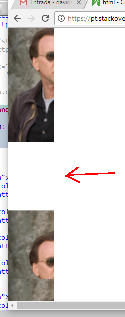
Run the Snipper on "Whole Page" to see it working right. Because it is with the Bootstrap classes according to the code you posted...

<!DOCTYPE html>
<html lang="en">
<head>
    <meta charset="utf-8" />
    <meta http-equiv="X-UA-Compatible" content="IE=edge">
    <title>Page Title</title>
    <meta name="viewport" content="width=device-width, initial-scale=1">
    <link rel="stylesheet" type="text/css" media="screen" href="https://maxcdn.bootstrapcdn.com/bootstrap/3.3.7/css/bootstrap.min.css" />
    <link rel="stylesheet" type="text/css" media="screen" href="https://maxcdn.bootstrapcdn.com/bootstrap/3.3.7/css/bootstrap-theme.min.css" />
    <link rel="stylesheet" type="text/css" media="screen" href="https://maxcdn.bootstrapcdn.com/font-awesome/4.7.0/css/font-awesome.min.css" />
<style>
 
    @media screen and (min-width: 768px) {
           .vertical{
              transform: translateY(50%);
           }
        }

</style>
</head>
<body>
    
<div class="row">
    <div class="col-md-3 col-ms-3 col-xs-3">
        <img src="http://placecage.com/50/150" style="height: 100%; width: 100%;">
    </div>
    <div class="col-md-3 col-ms-3 col-xs-3">
        <img src="http://placecage.com/50/150" style="height: 100%; width: 100%;">
    </div>
    <div class="col-md-3 col-ms-3 col-xs-3">
        <img src="http://placecage.com/50/150" style="height: 100%; width: 100%;">
    </div>
    <div class="col-md-3 col-ms-3 col-xs-3 vertical">
        <img src="http://placecage.com/50/150" style="height: 100%; width: 100%;">
    </div>
    </div>
    <div class="row">
    <div class="col-md-3 col-ms-3 col-xs-3">
        <img src="http://placecage.com/50/150" style="height: 100%; width: 100%;">
    </div>
    <div class="col-md-3 col-ms-3 col-xs-3">
        <img src="http://placecage.com/50/150" style="height: 100%; width: 100%;">
    </div>
    <div class="col-md-3 col-ms-3 col-xs-3">
        <img src="http://placecage.com/50/150" style="height: 100%; width: 100%;">
    </div>
</div>
    
    <script src="https://code.jquery.com/jquery-3.2.1.min.js"></script>
    <script src="https://maxcdn.bootstrapcdn.com/bootstrap/3.3.7/js/bootstrap.min.js"></script>
</body>
</html>

NOTE: To make no mistake on different screens you can put in the sizes div for each screen (col-Md-3 col-ms-3 col-Xs-3), kind of:

<div class="col-md-3 col-ms-3 col-xs-3 vertical">
    <img src="http://placecage.com/50/150" style="height: 100%; width: 100%;">
</div>
  • Can you improve your answer? There’s a problem with it :)

  • Puts the class inside @media screen and (min-width: 768px) { } because otherwise the div that you lined up will be poorly positioned when the screen is less than 768px

  • Yes @dvd is pq it is using only the class col-md if it use col-Md / col-Sm / col-Xs in the not error div. It would have to change in all @media actually. I will give an edited there.

  • It is because when the screen is smaller than 769px no longer needs this alignment class. Otherwise there will be a hole between two images.

  • then @dvd as I do?

  • @dvd I was trying here with the @media but I could not simulate the error. I could only use the grid measurements in the div, as I updated. :/

  • @Evertonfigueiredo I updated my answer, take a look at Observing right after the Snippet

  • So I mark which of the two answers as certain?

  • @Evertonfigueiredo No Everton, leave Hugo’s marked, he answered correctly, just forgot this detail.

  • 1

    No! rs... was right before... now it’s even worse r

Show 5 more comments

2

The response of @hugocsl is correct, but lacked put a @media Rule. Because the site is responsive, Bootstrap turns all columns into 1 only when the screen is smaller than 769px.

So, complementing the response of @hugocsl, CSS would look like this:

@media screen and (min-width: 768px) {
   .vertical{
      transform: translateY(50%);
   }
}

See the hole:

inserir a descrição da imagem aqui

1

I would put in a container a div of col-Md-12 to fill the screen and then move on with the div with class col-Md-6 each (if really only two Divs).

<div class="container">
<div class="row">
<div class="col-md-12" style="text-align:center">
<img src="#" alt="sua imagem">
</div>
</div>
<div class="row">
<div class="col-md-6">
<p>Aqui seria suas duas colunas em um ROW (já é mais que suficiente)</p>
</div>
<div class="col-md-6">
<p>Pode tambem alinhas com CSS ou de uma forma mais bruta usando o atributo style="text-align:center"; para a imagem geralmente uso isso.</p>
</div>

  • Alias if I understood well it would be useful to create a container that stores your Rows so it will have a size 12 Row and two size 6 Rows.

Browser other questions tagged

You are not signed in. Login or sign up in order to post.