Table body with overflow:scroll misaligned relative to header (HTML/CSS)

Asked

Viewed 977 times

1

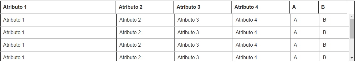
I have an alignment problem in a table where I needed to apply a scroll bar in the body, leaving the header fixed. It happens that the body cells are misaligned in relation to those of the header. Manipulating the width of the thead did not achieve precise result. I inserted border just to make it easier to visualize the problem.

https://uploaddeimagens.com.br/imagens/table_css-jpg

Follows the code:

<html>
   <head>
   <link rel="stylesheet" href="https://maxcdn.bootstrapcdn.com/bootstrap/3.3.7/css/bootstrap.min.css">
        <link rel="stylesheet" href="https://maxcdn.bootstrapcdn.com/bootstrap/3.3.7/css/bootstrap-theme.min.css">
        <style type="text/css">
            #listIcv thead {
                width: 98%;
                background-color: #DCDCDC;
            }
            #listIcv tbody {
                height: 150px;
                overflow-y: auto;
                width: 100%;
            }
            #listIcv thead, #listIcv tbody, #listIcv tr, #listIcv td, #listIcv th {
                display: block;
            }
            #listIcv tbody td, #listIcv thead > tr > th {
                float: left;
            }
        </style>
    </head>
    <body>
        <table class="table table-striped table-hover" id="listIcv">
            <thead>
                <tr>
                    <th class="col-xs-4">Atributo 1</th><th class="col-xs-2">Atributo 2</th><th class="col-xs-2">Atributo 3</th><th class="col-xs-2">Atributo 4</th><th class="col-xs-1">A</th><th class="col-xs-1">B</th>
                </tr>
            </thead>
            <tbody>
                <tr>
                    <td class="col-xs-4">Atributo 1</td><td class="col-xs-2">Atributo 2</td><td class="col-xs-2">Atributo 3</td><td class="col-xs-2">Atributo 4</td><td class="col-xs-1">A</td><td class="col-xs-1">B</td>
                    <td class="col-xs-4">Atributo 1</td><td class="col-xs-2">Atributo 2</td><td class="col-xs-2">Atributo 3</td><td class="col-xs-2">Atributo 4</td><td class="col-xs-1">A</td><td class="col-xs-1">B</td>
                    <td class="col-xs-4">Atributo 1</td><td class="col-xs-2">Atributo 2</td><td class="col-xs-2">Atributo 3</td><td class="col-xs-2">Atributo 4</td><td class="col-xs-1">A</td><td class="col-xs-1">B</td>
                    <td class="col-xs-4">Atributo 1</td><td class="col-xs-2">Atributo 2</td><td class="col-xs-2">Atributo 3</td><td class="col-xs-2">Atributo 4</td><td class="col-xs-1">A</td><td class="col-xs-1">B</td>
                    <td class="col-xs-4">Atributo 1</td><td class="col-xs-2">Atributo 2</td><td class="col-xs-2">Atributo 3</td><td class="col-xs-2">Atributo 4</td><td class="col-xs-1">A</td><td class="col-xs-1">B</td>
                    <td class="col-xs-4">Atributo 1</td><td class="col-xs-2">Atributo 2</td><td class="col-xs-2">Atributo 3</td><td class="col-xs-2">Atributo 4</td><td class="col-xs-1">A</td><td class="col-xs-1">B</td>
                    <td class="col-xs-4">Atributo 1</td><td class="col-xs-2">Atributo 2</td><td class="col-xs-2">Atributo 3</td><td class="col-xs-2">Atributo 4</td><td class="col-xs-1">A</td><td class="col-xs-1">B</td>
                </tr>
            </tbody>
        </table>
    </body>
</html>

2 answers

0

It is impossible to hit/fix this, each operating system or browser will have a type of scrollbar, the width will never be the desired

Another problem in your code is that you are applying col- which are classes for responsive elements in Ths and Tds, this at least will break the table one way or another, I will not give you a magic solution, what I will do is recommend that you use media-query (@media) to hide the columns you do not want or use overflow-x: auto; in the table directly, to apply a horizontal scroll when necessary, this can be done in bootstrap with table-responsive

 <link rel="stylesheet" href="https://maxcdn.bootstrapcdn.com/bootstrap/3.3.7/css/bootstrap.min.css">

<table class="table table-bordered table-responsive">
    <thead>
      <tr>
        <th>#</th>
        <th>Table heading</th>
        <th>Table heading</th>
        <th>Table heading</th>
        <th>Table heading</th>
        <th>Table heading</th>
        <th>Table heading</th>
      </tr>
    </thead>
    <tbody>
      <tr>
        <th scope="row">1</th>
        <td>Table cell</td>
        <td>Table cell</td>
        <td>Table cell</td>
        <td>Table cell</td>
        <td>Table cell</td>
        <td>Table cell</td>
      </tr>
      <tr>
        <th scope="row">2</th>
        <td>Table cell</td>
        <td>Table cell</td>
        <td>Table cell</td>
        <td>Table cell</td>
        <td>Table cell</td>
        <td>Table cell</td>
      </tr>
      <tr>
        <th scope="row">3</th>
        <td>Table cell</td>
        <td>Table cell</td>
        <td>Table cell</td>
        <td>Table cell</td>
        <td>Table cell</td>
        <td>Table cell</td>
      </tr>
    </tbody>
  </table>

  • Thank you very much, Guilherme. I was looking for a solution to this for a long time and I was beginning to suspect that I really could not correct 100%.

0


As Guilherme said there is no perfect world in this case, because each brwoser has its own scroll bar. But you can try to mitigate this with some techniques.

One option is discount the width of the scrollbar bar from the width of tbody. Kind of:

#listIcv tbody {
    height: 150px;
    overflow-y: auto;
    width: calc(100% - 9px); /* desconta a largura do scroll-bar */
}

Another technique is to use a scroll bar by jQuery, you andsconde o scroll default do Browser e usa um construido por jQuery.

Follow the project link: https://github.com/inuyaksa/jquery.nicescroll

Demo: https://nicescroll.areaaperta.com/

  • Thank you very much, Hugo. William’s explanation served to understand the logic of why this happens, and his answer served to get me the best "alignment". I wish I could mark both answers.

  • Forgive me, I disagree with this answer only in the part that talks to use Calc, I left well explained in the reply: It is impossible to hit/fix this, each operating system or browser will have a type of scrollbar, the width will never be the desired, 9px is not a standard size, the user can change the scrollbar, outside that in each browser is implemented a proper scroll scheme.

  • @Guilhermenascimento this crowsbrowser problem really gets complicated. Even the solution with jQuery the user can block the JS and the scroll disappear totally. What I tried to go through was a solution to mitigate the alignment problem only. The perfect solution I think does not exist yet, but change this idea only enriches the site, tmj [] s

  • So, but it’s not just cross-browser, if the user goes in the WINDOWS panel he can customize the scrollbar and will affect everything anyway.

Browser other questions tagged

You are not signed in. Login or sign up in order to post.