0
I have the following code:
<!-- Navigation Bar -->
<nav class="navbar navbar-expand-md navbar-light navperson">
    <!-- Brand -->
    <a class="navbar-brand" href="#"><img class="img-fluid logo" src="imagens/bonfireicon.png"></a>
    <!-- Hide Button -->
    <button type="button" class="navbar-toggler" data-toggle="collapse" data-target="#nav-content"
    aria-expanded="false" aria-label="Toogle Navigation">
        <span class="navbar-toggler-icon"></span>
    </button>
    <!-- NavBar Content -->
    <div class="collapse navbar-collapse" id="nav-content">
        <ul class="navbar-nav mr-auto">
            <li class="nav-item active">
                <a class="nav-link hvr-sweep-to-right" href="#">
                    <span class="fa-stack">
                        <span class="fa fa-square-o fa-stack-2x"></span>
                        <span class="fa fa-home fa-stack-1x"></span>
                    </span>
                    Home
                </a>
            </li>
            <li class="nav-item active">
                <a class="nav-link hvr-sweep-to-right" href="#">
                    <span class="fa-stack">
                        <span class="fa fa-square-o fa-stack-2x"></span>
                        <span class="fa fa-flask fa-stack-1x"></span>
                    </span>
                    Estus Flasks
                </a>
            </li>
            <li class="nav-item active">
                <a class="nav-link hvr-sweep-to-right" href="#">
                    <span class="fa-stack">
                        <span class="fa fa-square-o fa-stack-2x"></span>
                        <span class="fa fa-bomb fa-stack-1x"></span>
                    </span>
                    Capra Demon
                </a>
            </li>
            <li class="nav-item active">
                <a class="nav-link hvr-sweep-to-right" href="#">
                    <span class="fa-stack">
                        <span class="fa fa-square-o fa-stack-2x"></span>
                        <span class="fa fa-ravelry fa-stack-1x"></span>
                    </span>
                    Areas
                </a>
            </li>
            <li class="nav-item active">
                <a class="nav-link hvr-sweep-to-right" href="#">
                    <span class="fa-stack">
                        <span class="fa fa-square-o fa-stack-2x"></span>
                        <span class="fa fa-shield fa-stack-1x"></span>
                    </span>
                    Legendary Items
                </a>
            </li>
        </ul>
        <!--Login Button Triggers Modal-->
        <form class="form-inline my-2 my my-lg-0">
            <button type="button" data-toggle="modal" data-target="#modal-login" class="btn btn-outline-info">Logar</button>
        </form>
    </div>
</nav>
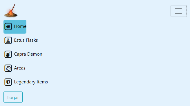
This code makes you create a navbar similar to this:

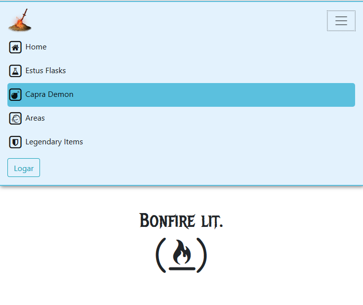
The bootstrap Toggler function makes it look like this on a mobile/tablet:
What do I want? Working with the div when she’s in "toggled" form, I want to manipulate her appearance only when she is viewing on mobile for example, because when I change the properties in css, ends up changing also when she is not "collapsed" or in full screen.
I want to improve usability by making the navbar menu fill the entire screen of the phone, and not only in the left corner, so that increase the selection field to achieve the desired content.
In the documentation https://getbootstrap.com/docs/4.0/layout/grid/ Ctrl+f "class prefix". You can configure the Divs for specific screen sizes. Maybe it’ll help you
– Fabio Luz