Very large input fields

Asked

Viewed 236 times

0

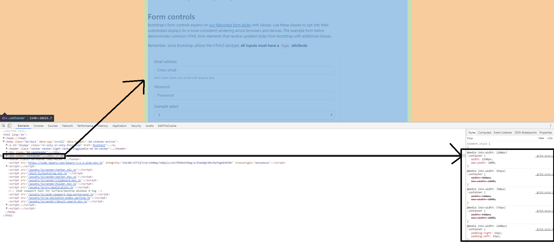
When copying and pasting a simple code from an example form on the bootstrap website, the following occurs:

inserir a descrição da imagem aqui

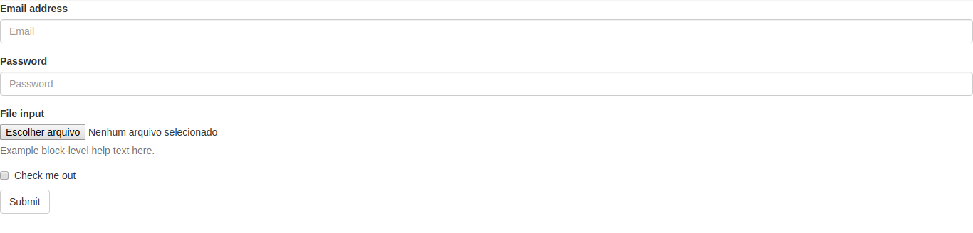
Why are these fields like this ? According to the example they should be much smaller.

<link rel="stylesheet" href="https://maxcdn.bootstrapcdn.com/bootstrap/3.3.7/css/bootstrap.min.css" integrity="sha384-BVYiiSIFeK1dGmJRAkycuHAHRg32OmUcww7on3RYdg4Va+PmSTsz/K68vbdEjh4u" crossorigin="anonymous">
</head>
<body>
  <form>
    <div class="form-group">
      <label for="exampleInputEmail1">Email address</label>
      <input type="email" class="form-control" id="exampleInputEmail1" placeholder="Email">
    </div>
    <div class="form-group">
      <label for="exampleInputPassword1">Password</label>
      <input type="password" class="form-control" id="exampleInputPassword1" placeholder="Password">
    </div>
    <div class="form-group">
      <label for="exampleInputFile">File input</label>
      <input type="file" id="exampleInputFile">
      <p class="help-block">Example block-level help text here.</p>
    </div>
    <div class="checkbox">
      <label>
        <input type="checkbox"> Check me out
      </label>
    </div>
    <button type="submit" class="btn btn-default">Submit</button>
  </form>

1 answer

4


The difference is that in the example the code is inside a Container (container class).

The class container does not appear in the example because, generally, it is single per page. But, if you analyze the source code of the example page, you will see that it is there with its respective values.

See the image below to better understand:

inserir a descrição da imagem aqui

To illustrate what is done, see the example below:

.container {
  width: 400px;
}
<link rel="stylesheet" href="https://maxcdn.bootstrapcdn.com/bootstrap/3.3.7/css/bootstrap.min.css" integrity="sha384-BVYiiSIFeK1dGmJRAkycuHAHRg32OmUcww7on3RYdg4Va+PmSTsz/K68vbdEjh4u" crossorigin="anonymous">

<div class="container">
  <form>
    <div class="form-group">
      <label for="exampleInputEmail1">Email address</label>
      <input type="email" class="form-control" id="exampleInputEmail1" placeholder="Email">
    </div>
    <div class="form-group">
      <label for="exampleInputPassword1">Password</label>
      <input type="password" class="form-control" id="exampleInputPassword1" placeholder="Password">
    </div>
    <div class="form-group">
      <label for="exampleInputFile">File input</label>
      <input type="file" id="exampleInputFile">
      <p class="help-block">Example block-level help text here.</p>
    </div>
    <div class="checkbox">
      <label>
        <input type="checkbox"> Check me out
      </label>
    </div>
    <button type="submit" class="btn btn-default">Submit</button>
  </form>
</div>

Note that at the beginning of your code I added a div with class container. To illustrate I decrease the width from it to 400px, but bootstrap does it for you.

Note that it is not only the inputs which follow the size, but rather all elements within the container.

If you think the size is larger or smaller than what you want, you can customize it the way you think best.

Browser other questions tagged

You are not signed in. Login or sign up in order to post.