0
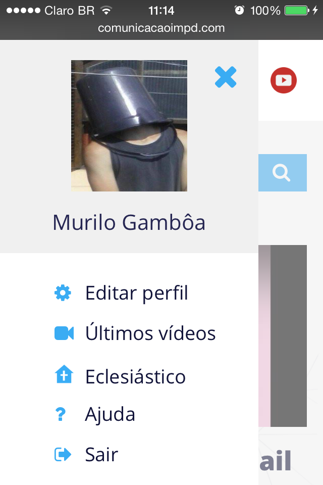
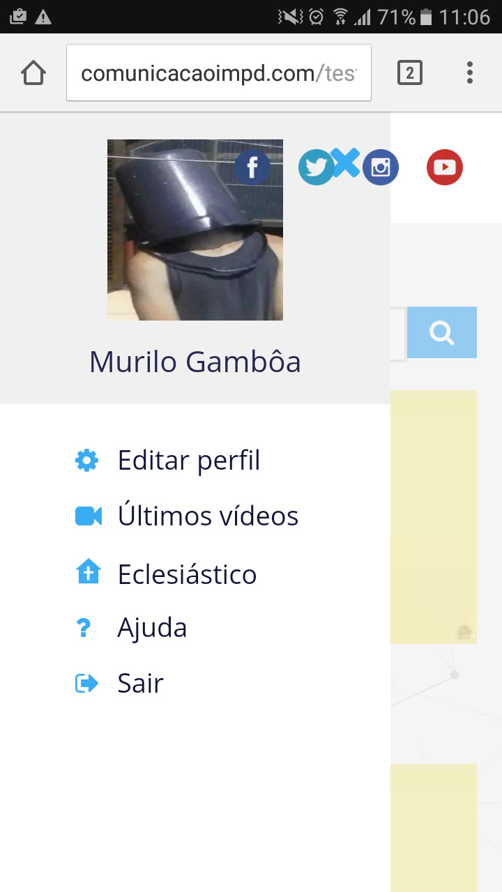
Well, I’m performing a responsive menu, it was working perfectly, and it’s still on most devices, the problem is that, in the second image, using a mobile phone with the newest android version the Buga menu and the social icons are on top, I tried to use z-index, but it’s not working. Someone would know how to solve ?
*HTML and CSS at the end of the question
Iphone 5 - android ver 5.0.1
Galaxy On7 - android ver 6.0.1
HTML
<div class="header-mobile on-top" id="mobile-header">
            <div class="user-holder">
                <p class="user-list"><!-- Ícone para abrir o menu --></p>
                <nav class="user-opt">
                    <p id="close-i">
                        <i class="fa fa-times fa-2x" aria-hidden="true"></i>
                    </p>
                    <!-- Imagem mostrada dentro do menu e nome de usuário -->
                    <figure class="imagem-atual">
                        <img src="img/perfil.jpg" alt="imagem-usuário">
                        <figcaption>Murilo Gambôa</figcaption>
                    </figure>
                    <!-- Barra de Opções -->
                    <ul>
                        <a href="meu-perfil.html"><li class="item-1"><i class="fa fa-cog i-menu" aria-hidden="true"></i><span>Editar perfil</span></li></a>
                        <a href="ultimos-adicionados.html"><li class="item-2"><i class="fa fa-video-camera i-menu" aria-hidden="true"></i><span>Últimos vídeos</span></li></a>
                        <a href="http://webmail.impd.org.br/webmail" target="_blank"><li class="item-3"><i class="fa i-church i-menu"></i><span>Eclesiástico</span></li></a>
                        <a href="ajuda.html"><li class="item-4"><i class="fa fa-question i-menu" aria-hidden="true"></i><span>Ajuda</span></li></a>
                        <a href="index.html"><li class="item-5"><i class="fa fa-sign-out i-menu" aria-hidden="true"></i><span>Sair</span></li></a>
                    </ul>
                </nav>
                <!-- Ícones sociais -->
                <ul class="social" id="social-icons">
                    <li class="is is-1"><a href="" class="is" target="_blank">Facebook</a></li>
                    <li class="is is-2"><a href="" class="is" target="_blank">Twitter</a></li>
                    <li class="is is-3"><a href="" class="is" target="_blank">Instagram</a></li>
                    <li class="is is-4"><a href="" class="is" target="_blank">YouTube</a></li>
                </ul>
            </div>
        </div>
CSS
/* Menu do usuário */
.user-opt{
    width: 80%;
    max-width: 280px !important;
    height: 100%;
    max-width: 360px;
    background-color: rgba(255,255,255,1);
    position: fixed;
    top: 0;
    left: -360px;
    z-index: 2;
    transition: left .6s ease-in-out;
}
/* Itens do Menu */
#close-i{
    position: absolute;
    top: 20px;
    right: 20px;
    color: rgba(58,172,243,1);
}
/* Alinhamento de texto para as opções da lista */
.user-opt ul a li{
    box-sizing: border-box;
    padding: 10px;
    position: relative;
    height: 100%;
}
/* Ícones Sociais */
.social{
    float: right;
}
.i-menu{
    margin-left:44px;
    width:30px;
}