Nav bar overlaying page content!

Asked

Viewed 5,832 times

1

Hello I have a page with a menu (Nav bar) and when I click on a link from the menu the page should direct to Session corresponding, for example, when I click on I have a Session about which should be displayed, it happens that when I do this to Session is with a hidden part behind the menu, ie the height menu is not respected as in the following image

inserir a descrição da imagem aqui

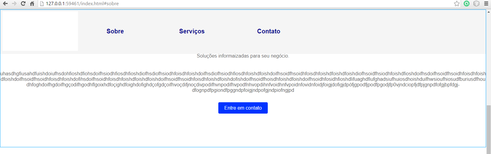
What is with a blue outline is the Session, notice how it goes up there behind the menu.

HTML CSS

nav {
    display: flex;
    flex-direction: column;
    align-items: center;
    background-color: #f5f5f5;
    position: fixed;
    top:0;
    width: 100%;

}
nav a img{
    display: flex;
    text-align: center;
    flex-direction: column;
    width: 200px;
    padding: 0;

}

nav > a{
    text-decoration: none;
    color: azure;
    font-weight: 700;
    font-size: 28px;
    font-family: serif
}

nav ul{
    list-style: none;
    padding: 10px;
    display: flex;
    flex-direction: column;
    align-items: center;
    width: 100%;
}
nav ul li{
    text-align: center;
    width: 100%;
    font-weight: bold;
    font-size: 20px
}
nav ul li a {
    display: inline-block;
    padding: 10px 0;
    width: 100%;
    text-decoration: none;
    color: darkblue;

}
 <nav>
    <a href="#top"><img src="imagens/Logo%20DMDUQUE%20Final.png"></a>
    <ul>
        <li><a href="#sobre">Sobre</a></li>
        <li><a href="#servicos">Serviços</a></li>
        <li><a href="#contato">Contato</a></li>                
    </ul>
</nav>

  • Marlyson, post Nav bar HTML.

1 answer

3

What’s happening is that as your element <nav> is with position: fixed it does not "take up space" on the page, so the content below starts at the top, below the <nav>.

Puts a padding-top: 15px (Being 15px only an example value, you can change depending on the code) in your content that the top bar will no longer overwrite.

  • Vinicius, it says that when the page is rendered on a smaller screen, like that of a mobile phone for example, navBar is squeezed and gets larger vertically, hiding some items of the page, It is possible to put the padding in terms of the size of Nav bar: padding-top: 100% da nav bar?

  • 1

    @Yoyo I think the best way to make a navbar that will fix on the screen with scroll, without using JS, is with position: Sticky. Gives a study that I believe may be the solution you are looking for: http://loopinfinito.com.br/2013/05/28/css-position-sticky/ In this case, do not apply any padding-top, and leave the element <nav> with position: sticky

Browser other questions tagged

You are not signed in. Login or sign up in order to post.