0
I’m having a little trouble finding myself using the float property of css. Currently this is what I have with my code:
But I need it to stay that way:
Only other than crooked and out of the blue box when resizing the screen mess a lot. Where am I missing? Follow my html and css codes:
#section-one{
  background-image: url(../images/barra-sessao1.png);
  background-repeat: no-repeat;
  background-size: 100% 100%;
  width: 100%;
  height: auto;
  clear: both;
}
.conteudo-1{
  text-align: left;
  font-family: Lucida Sans Unicode;
  width: 500px;
  margin-left: 250px;
}

.conteudo-1 h1{
  color: #d58502;
  text-transform: uppercase;
  font-size: 3em;
  font-weight: bold;
}

.conteudo-1 p{
  color: #fff;
  font-size: .8em;
}

#imagem-direita{
  float: right;
}


#imagem-direita img{
  width: 350px;
}
<!-- Section one -->
<section id="section-one">
<div id="imagem-direita">
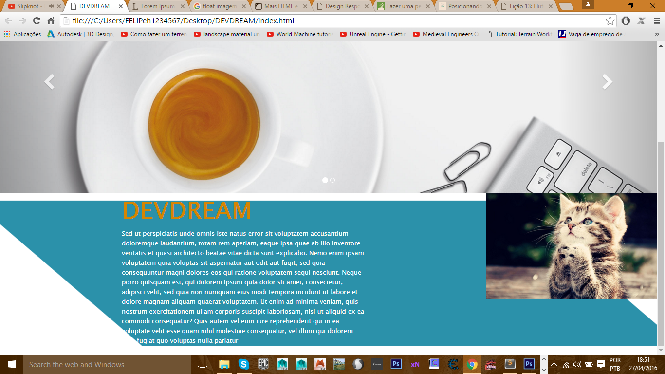
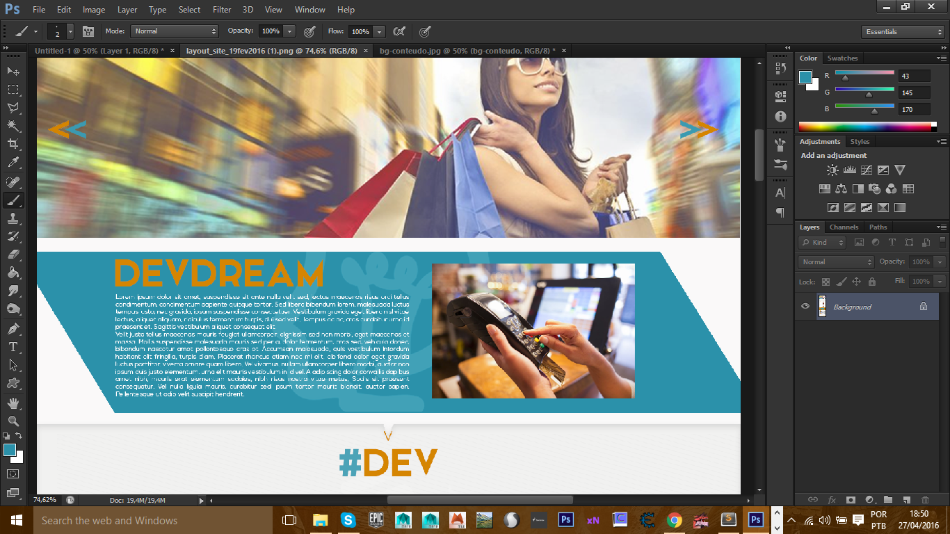
<img src="images/bg-conteudo.png" alt="devdream" >
</div>
<div class="conteudo-1">
<h1>devdream</h1>
<p>
Sed ut perspiciatis unde omnis iste natus error sit voluptatem accusantium doloremque laudantium, totam rem aperiam, eaque ipsa quae ab illo inventore veritatis et quasi architecto beatae vitae dicta sunt explicabo. Nemo enim ipsam voluptatem quia voluptas sit aspernatur aut odit aut fugit, sed quia consequuntur magni dolores eos qui ratione voluptatem sequi nesciunt. Neque porro quisquam est, qui dolorem ipsum quia dolor sit amet, consectetur, adipisci velit, sed quia non numquam eius modi tempora incidunt ut labore et dolore magnam aliquam quaerat voluptatem. Ut enim ad minima veniam, quis nostrum exercitationem ullam corporis suscipit laboriosam, nisi ut aliquid ex ea commodi consequatur? Quis autem vel eum iure reprehenderit qui in ea voluptate velit esse quam nihil molestiae consequatur, vel illum qui dolorem eum fugiat quo voluptas nulla pariatur
</p>
</div>
</section>
First of all, why are you wearing
floatin this layout after all? I think the biggest problem is this. Regardless, I have the impression that you are not usingposition:in no element, which is already problematic also.– Bacco
I am using float because the image should float next to the text but I did not want to leave the box that would be this image with skew effect plus the biggest problem and when I redeem
– Felipe Henrique
I think it pays to use right: with absolute position, but would have to see the code better.
– Bacco