2
I would like to know if it is possible to make a group of cols-* stay as carouel/slider only when less than 750px.
First of all, for those who do not understand bootstrap well, both grids and Carousel are native parts of bootstrap, ie I would like to combine these two:
http://getbootstrap.com/examples/grid/ and http://getbootstrap.com/examples/carousel/
So the question here is about the bootstrap components. It currently works like this:
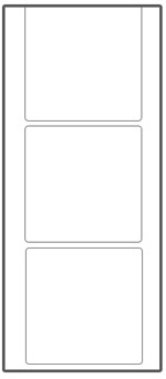
Screens larger or equal than 750px wide:

Screens smaller than 750px wide break the items, this drawing is imitating a cell phone screen (not drawing very well):
However I wonder if it is possible to turn it into this (when less than 750px), this drawing is imitating a cell screen, the white space is because it has no more html elements and would be a basic example, but on a full page the space would not appear:
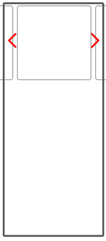
In other words, in small screens I would like to transform the cols- in a slider, so these columns would continue horizontally instead of breaking, I remember if and I did not mistake having seen a site like this, I was on mobile and I could not analyze the code.
In my current code I use the class col-sm-3 so that when the screen is less than 750px the items are not standing next to each other (the basic concept of boostrap grid system), so:
<script src="https://ajax.googleapis.com/ajax/libs/jquery/1.11.1/jquery.min.js"></script>

<!-- Latest compiled and minified CSS -->
<link rel="stylesheet" href="https://maxcdn.bootstrapcdn.com/bootstrap/3.3.6/css/bootstrap.min.css" integrity="sha384-1q8mTJOASx8j1Au+a5WDVnPi2lkFfwwEAa8hDDdjZlpLegxhjVME1fgjWPGmkzs7" crossorigin="anonymous">

<!-- Optional theme -->
<link rel="stylesheet" href="https://maxcdn.bootstrapcdn.com/bootstrap/3.3.6/css/bootstrap-theme.min.css" integrity="sha384-fLW2N01lMqjakBkx3l/M9EahuwpSfeNvV63J5ezn3uZzapT0u7EYsXMjQV+0En5r" crossorigin="anonymous">

<!-- Latest compiled and minified JavaScript -->
<script src="https://maxcdn.bootstrapcdn.com/bootstrap/3.3.6/js/bootstrap.min.js" integrity="sha384-0mSbJDEHialfmuBBQP6A4Qrprq5OVfW37PRR3j5ELqxss1yVqOtnepnHVP9aJ7xS" crossorigin="anonymous"></script>

<section>
        <h2 class="section-heading text-center">Lançamentos</h2>
        <hr class="primary">
        <div class="row nospace">
            <div class="col-sm-3">
                <div class="item">
                    <img src="images/produto1.jpg" class="img-responsive">
                    <h3>Produto</h3>
                </div>
            </div>
            <div class="col-sm-3">
                <div class="item">
                    <img src="images/produto2.jpg" class="img-responsive">
                    <h3>Produto</h3>
                </div>
            </div>
            <div class="col-sm-3">
                <div class="item">
                    <img src="images/produto3.jpg" class="img-responsive">
                    <h3>Produto</h3>
                </div>
            </div>
            <div class="col-sm-3">
                <div class="item">
                    <img src="images/produto4.jpg" class="img-responsive">
                    <h3>Produto</h3>
                </div>
            </div>
        </div>
    </section>
I’m not sure, but it wouldn’t just be using
hiddenandvisible-xs, and in thevisible-xsput the slide you want (there are many for bootstrap). Maybe the answer of this question that talks about thehiddenandvisible-xscan help...– gustavox
@gustavox I liked the idea, but the items would be duplicated on the page :/
– Guilherme Nascimento
If you scroll PHP you could make a template and put one
includein both... but then I don’t know if it’s worth it.... btw - > http://shouldiuseacarousel.com/ :P– gustavox
@gustavox I think with the
visible-xsi will achieve the desired effect :D In the short year next put the answer!– Guilherme Nascimento
It seems to me that whoever downvoted it is because they didn’t understand that Carousel is a native component of bootstrap. Please comment on the reason for the downvote, so I can understand and try to improve the question.
– Guilherme Nascimento
Well, for the record, it obviously wasn’t me.
– gustavox
For his comment on the
visible-xsI can say that you were the one who most noticed that this question speaks of the native components, at the time you quote another component ;)– Guilherme Nascimento