21
How can I make the geometric shapes below using preferably CSS? If not possible using CSS only I also accept answers with other methods.


21
How can I make the geometric shapes below using preferably CSS? If not possible using CSS only I also accept answers with other methods.
16
Use transform: rotate the child elements, and perspective, in the parent element.
.a{
  perspective:1000px;
  text-align:center;
}

.b{
    transform:rotateX(-60deg);
    width:100px;
    background:gold;
    height:100px;
 }

.c{
    transform:rotateX(30deg);
    width:100px;
    background:tomato;
    height:100px;
}
.d{
    transform:rotateY(30deg);
    width:100px;
    background:lightgreen;
    height:100px;
}
<div class="a">
<div class="b">B</div>
<div class="c">C</div>
<div class="d">D</div>
</div>The estate perspective affects only the child elements from which this property was defined, but does not affect itself.
perspective?This property allows you to change the perspective in which the 3D elements are seen. The perspective property determines the distance between the plane Z and the user in order to give the 3D element some perspective.
The intensity of the effect is determined by the value of perspective. The lower the value, the closer you start from plane Z. The higher the value, the more subtle the effect.
When defining the property perspective in an element, it is the child elements that receive the perspective in which it is seen, not the element itself.
Note: Perspective property affects only elements transformed in 3D!
References (where I did a half-ass translation):
http://www.w3schools.com/cssref/trycss3_perspective_inuse.htm
https://developer.mozilla.org/en-US/docs/Web/CSS/perspective
How does the perspective? The 1000px What do you mean? That the vanishing point is 1000px away?
@bfavaretto, if you can supplement the answer, will help me. That’s one of the things I know that works, but I can’t explain why it works. I’m being honest with you.
I don’t know either :P But if I find out, I complement.
@bfavaretto, I know that the size of the perspective influences the way the object will be rotated.
16
Simpler and more like your image:
.trapezio {
border-bottom: 70px solid #c1c1c1;
border-left: 30px solid transparent;
border-right: 15px solid transparent;
height: 0;
width: 120px;
}

.trapezioinvertido {
border-top: 70px solid #c1c1c1;
border-left: 30px solid transparent;
border-right: 15px solid transparent;
height: 0;
width: 120px;
}

.paralelograma {
width: 150px;
height: 70px;
-webkit-transform: skew(-20deg);
   -moz-transform: skew(-20deg);
     -o-transform: skew(-20deg);
background: #c1c1c1;
}
<html>
<head>
<title></title>
</head>
<body>
<div class="trapezio"></div>
</br>
<div class="paralelograma"></div>
</br>
<div class="paralelograma"></div>
</br>
<div class="trapezioinvertido"></div>
</body>
</html>Wow, David, just perfect! Thanks a lot for the help, it was very useful!
I may have repeated trapeze code, but I believe that way it becomes clearer to understand how forms work :)
It’s perfect, thank you very much!
A question David, does this also make you in the race or is there any generator? When I need these forms I resort to a library of my own that I have stored some, but it was difficult to do manual.
@Renancavalieri then, I used the CSS base to create, so I hand made the slope shown in the image.
I need to put this in the background of a link, can I do that and put a text in it? Actually making a <a href=""></a> with the forms, rather than a div...
I believe so @Tiagop. C, I can’t do it for you now, but ask another question that gets better and easier.
right @David, here it is: http://answall.com/questions/100126/usar-links-formas-geom%C3%A9tricas
11
There are a few ways to do this. I will add some of the ways you asked here.
#trapezoid {
  border-bottom: 100px solid red;
  border-left: 50px solid transparent;
  border-right: 50px solid transparent;
  height: 0;
  width: 100px;
}

#parallelogram {
  width: 150px;
  height: 100px;
  -webkit-transform: skew(20deg);
  -moz-transform: skew(20deg);
  -o-transform: skew(20deg);
  background: red;
}
<div id="trapezoid">Trapezoide</div>
<br/><br/><br/><br/><br/><br/><br/><br/><br/><br/>
<div id="parallelogram">Paralelogram</div>The rest you just change the properties the way you want.
On this Website has several examples of geometric shapes.
I didn’t, Randrade. Very good! + 1
@Wallacemaxters I’m a little busy right now, then I calmly explain the properties, for a better understanding of AP.
10
Use polygon:
svg polygon { fill: #666 }<svg width='200' height='100'>
<polygon points='0,100 50,0 150,0 200,100'/>
</svg>
<svg width='200' height='100'>
<polygon points='0,100 50,0 200,0 150,100'/>
</svg>
<svg width='200' height='100'>
<polygon points='50,100 0,0 200,0 150,100'/>
</svg>How would you put a <a href=""> inside this?
There are several ways, but that’s another question.
@Renan, I believe with Polygon is the most sensible way to do it. I do not approve much of the question of using Skew and Border, because the first distorts and the second hinders the positioning of internal elements. + 1.
@Dorivalzanetto The second one is horrible, the first one can still create an element inside and apply a skew with negative value to correct the text. But it seems to me
6
Using CSS only, this is as much as you can achieve: http://jsfiddle.net/8o4f01pg/
The estate skew is that will 'distort' the div the way you want it.
.skew{
    transform:skew(40deg);
}
.skew p {
    transform:skew(-40deg);
}
Note that it is important to apply the value negatively to the child of this div, so that it can continue 'normal'.
The problem with its layout is that in addition to the distortion it also has different height and width in each 'corner'.
The only way to achieve this result (as far as I know) would be through a svg.
Using the SVG method, which allows creating complex shapes.
This code example will generate a "div" with random widths and heights:
<div class="container">
    <div class="col-lg-6">
        <svg class="svg" viewBox="0 0 910 500" >
            <defs>
                <pattern id="img1" patternUnits="userSpaceOnUse" width="900" height="490">
                    <image xlink:href="http://www.thesaleslion.com/wp-content/uploads/2013/12/web-design.jpg" x="0" y="0" width="890" height="480" />
                </pattern>
            </defs>
            <polygon points="96.729,27.124 10,470.109 867.032,420.878 890,10" fill="url(#img1)"/>
        </svg>
    </div>
</div>
However, I chose not to use this model because it becomes 'boring' to work on maintenance. Each "div" or block you will generate should be drawn before moving to html. I did it through Illustrator, saved in svg and took only the code that generated the form (it was easier for me because it already involved other services that needed it the same way - there may be easier/simpler methods).
The code representing the "div" format would be this:
<polygon points="96.729,27.124 10,470.109 867.032,420.878 890,10" fill="url(#img1)"/>
Where you also already have a background image, referenced within the tag pattern.
Already the size of the "div" is managed here:
<svg class="svg" viewBox="0 0 910 500" >
Where the viewbox determines its size.
The code I gave you already works responsive. But as said before, the maintenance of this model is quite complex, compared to the maintenance of a simple div.
See a functional example here: http://jsfiddle.net/1rmd2otz/7/
If you can’t do it only with CSS, it’s no problem either, as you would with svg?
I edited my reply @Tiagop. C
3
It is possible to do also with Clip-Path!
As it was not cited in any of the other answers I will give a solution usingclip-path:polygon
.trap, .skw, .skw-inc, .trap-inv  {
    width: 160px;
    height: 80px;
    background-color: #666;
    margin: 1rem;
}
.trap {
    -webkit-clip-path: polygon(20% 0%, 91% 0, 100% 100%, 0% 100%);
    clip-path: polygon(20% 0%, 91% 0, 100% 100%, 0% 100%);
}
.skw {
    -webkit-clip-path: polygon(25% 0%, 100% 0%, 75% 100%, 0% 100%);
    clip-path: polygon(25% 0%, 100% 0%, 75% 100%, 0% 100%);
}
.skw-inc {
    -webkit-clip-path: polygon(25% 0%, 100% 0%, 89% 100%, 0% 100%);
    clip-path: polygon(25% 0%, 100% 0%, 89% 100%, 0% 100%);
}
.trap-inv {
    -webkit-clip-path: polygon(0 0, 100% 0, 89% 100%, 23% 100%);
    clip-path: polygon(0 0, 100% 0, 89% 100%, 23% 100%);
}
<div class="trap"></div>
<div class="skw"></div>
<div class="skw-inc"></div>
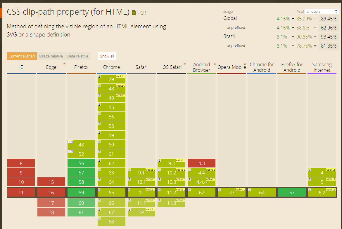
<div class="trap-inv"></div>clip-phat https://www.w3.org/TR/css-masking-1/#the-clip-pathOBS!: Unfortunately it still doesn’t work on IE or EDGE, however more than 90% of browsers around the world already support the clip-phat https://caniuse.com/#feat=css-clip-path
Browser other questions tagged css css3
You are not signed in. Login or sign up in order to post.
You will use the
rotateXorrotateYand, in the parent element, will set the perspective.– Wallace Maxters
do it using border and skew
– Gabriel Rodrigues
Surely, that question deserves a favorite little star ;)
– Wallace Maxters