What are CSS grids:
CSS grids are nothing more than the "simulation" of a tabular structure through divs. If you started playing with the internet at the time of IE6 and the like, you should remember that tables were widely used to structure HTML layouts. This was due to the fact that it was easier to work with layout in grid format on the web, and the table had a behavior similar to a grid (a table of 10 rows x 10 columns would simulate a grid of 10x10).
The problem is that tables have certain peculiarities, such as the fact that they don’t do very well with responsive layouts (after all, tables were thought to behave as "plastered" structures from the beginning), and semantically speaking, are not recommended for use in building a page layout (as you think a blind reader will understand a page that is all done within a multitude of tables, which are being erroneously used to assemble layouts rather than display tabular data?).
Combine these factors with the fact that layouts are becoming more complex every day and with an increasing number of devices of all sizes with internet access and it becomes evident that layouts using tables have never been and would never be the best solution available.
It was then that the developers realized that if they could reproduce the grid functionality of a table, with the mobility and responsiveness of the block elements (divs) this would make the layouts assembly process much easier, being the perfect solution to finally subistituite the tables. Thus was born the concept of CSS grids.
Some of the advantages of using CSS grids are:
- Semantically correct (layout elements being used for layout);
- Allows easy styling and malleability;
- Allows restructuring total grid blocks according to device size (try resizing your browser
by accessing the Bootstrap website);
How to use CSS grids:
As you said yourself in your question, virtually all CSS frameworks come with a grids system with them, and although the class names change, usually the structure is always the same (and even will remind you the structure of a table):
[bloco-pai]
     |
     |----[linha]
     |       |
     |       |----[coluna]
This structure above can be described in HTML as:
<div class="bloco-pai">
    <div class="linha">
        <div class="coluna"></div>
    </div>
</div>
Each bloco-pai may have n lines, and each linha may have n columns (theoretically, although most frameworks accept a total of at most 12 or 24 columns)
As you can see, the structure of a CSS grid is very similar to the structure of a table, I’ll show you an example:
<table> <!-- equivalente ao bloco-pai -->
    <tr> <!-- equivalente a linha -->
        <td></td> <!-- equivalente a coluna -->
    </tr>
</table>
After you understand that the structure of a CSS grid is nothing more than the equivalent structure of a table, it is much easier to understand what you are doing in the code.
Well, what if I want to work with CSS grids, but using columns of different sizes?
That’s where those classes come in with strange names bootstrap:
These classes, when added in a spine define a specific size for it, which would be the equivalent of colspan in the tables.
So let’s take one more example, this time using Bootstrap:
<div class="container">
<div class="row">
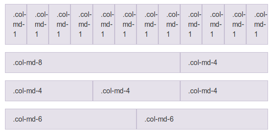
<div class="col-md-8"></div> <!-- Esta coluna terá um tamanho de 8/12 -->
<div class="col-md-4"></div> <!-- Esta coluna terá um tamanho de 4/12 -->
</div>
</div>
As you can see, the basic structure above will generate a "grid" with a row and two columns, one of size 8/12 (66.66%) and another of size 4/12 (33.33%).
Remembering that column sizes are usually never defined in px (pixels), but yes in % (percentage), so they always assume a percentage of the parent element’s size above them.
This means that if you create a parent element with a width of 1000px and add two columns with size 6/12 (i.e., 50%) within it, these columns would assume 500px width each. If the size of the parent element is changed to 500px, both columns would now have 250px, and so on.
Well, CSS grids have many more advantages and extra details that if they were to be written here would end up generating a bigger answer than this already is, so I leave the rest as homework for you to read on bootstrap documentation.
Bonus:
For those who don’t know, there is a pattern of CSS grids being specified by W3C, and -pasmen-, IE10+ has already implemented the functionality. Worth a look at.