1
HTML and CSS:
ul.ulVertical {
  border: .1px rgb(0, 0, 0) solid;
    list-style: none;
  height: 100px;
}

ul.ulVertical li {
  display: inline-block;
  border-top: .1px rgb(0, 0, 0) solid;
  transform: rotate(270deg);
}

ul.ulVertical li:last-chield {
  border: none;
}
<ul class="ulVertical">
<li>Passo 1</li>
<li>Passo 2</li>
<li>Passo 3</li>
<li>Passo 4</li>
<li>Passo 5</li>
</ul>What’s wrong with it?
The goal is that the li stay inside the ul.
Exit:

worked but the height (now would be the width? ) needs to be the same as UL. How to do it? I did it with height : 100% and width: 100%. No!
– Carlos Rocha
@Carlosrocha Vc wants the text to be centered on the container is this?
– hugocsl
Well, come on. The goal is for every LI to be the height of the UL. That the IL is vertical (as you have already guided in the answer) and that the text is centered both vertically and horizontally within the IL
– Carlos Rocha
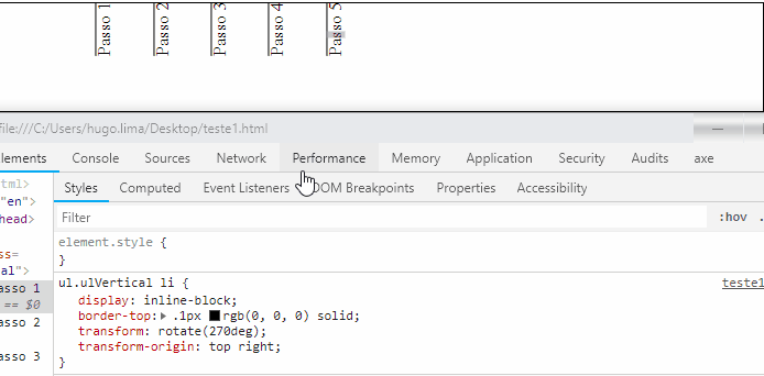
@Carlosrocha in this case you don’t even need the Transform-Origen then to control it. Just in UL you put
display: flex;andalign-items: center;, your UL will look like this https://prnt.sc/mre6yq, if that’s what I understand you want– hugocsl
Note that in the act, the li did not fill the whole UL. You can tell by the edge of the line And another thing I’d like you to use: inline-block instead of Flex. It will look better for me when it comes to making the other mobile screens
– Carlos Rocha
@Carlosrocha then just put width: 100px; and text-align: center; in the LI it will look like this http://prntscr.com/mrek5m
– hugocsl
now that it has. But it has the drawback that there is a very large separation between one li and the other, and not only the 30px of height . It looks like he’s using the width of li to set a spacing, how does it solve this?
– Carlos Rocha
@Carlosrocha you will have to use translateY() next to the Rotate in each item to do what you want https://imgur.com/EGEIqX4 . Otherwise the other option is to start everything from 0 and use another technique to make that alignment, or position:Switch to LI and line up one by one in the hand too.
– hugocsl