4
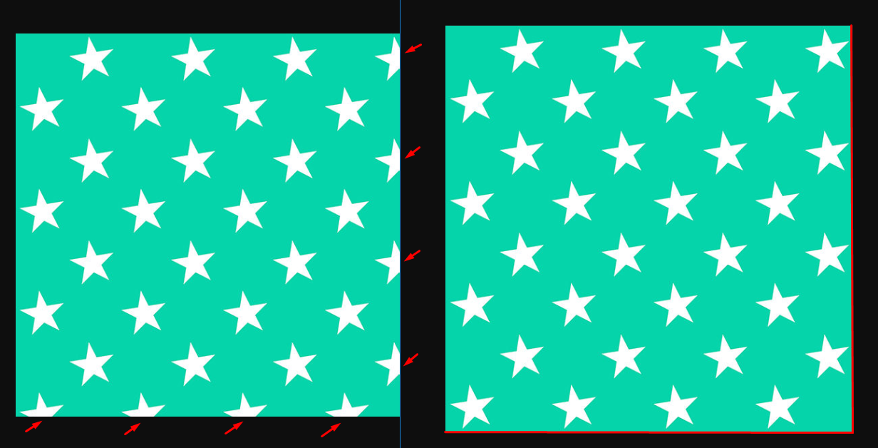
I have a Pattern that is repeated in both X and Y that I want to use as background in a div, but I’d like it to fit within the div without cutting on the sides as in the image. (I want them to have only entire stars in the background). I wanted the background fits in such a way that it does not cut pieces of the star and is composed only of whole figures.
The intention is that the background repeat and fit inside the container, but without cutting the ends, see the signs in red
Is there any way to control how the background repeats inside the container to avoid some piece getting cut?
(container size is not fixed, height and width may vary)
.x {
    width: 200px;
    height: 200px;
    margin-right: 10px;
    font-size: 3rem;
    color: red;
    background-image: url(https://cdn0.iconfinder.com/data/icons/Toolbar_Icon_Set_by_shlyapnikova/32/star.png);
}
<div class="x"></div>Imagery: https://cdn0.iconfinder.com/data/icons/Toolbar_Icon_Set_by_shlyapnikova/32/star.png
Wouldn’t it be better to make your class "x" be just 1 star that is your image and wouldn’t cut. And repeat your class "x" ? Use "background-repeat: no-repeat;" not to repeat the background image..
– Ricardo Lucas
@Ricardolucas but even that way she could get cut at the end right... And I would still have to have several Divs one below the other to be able to occupy the entire container with stars....
– hugocsl
Not expensive when you put the no-repeat in the background it just leaves 1 images that is of your star, so if you make several times the call of the class "x" will appear the normal star without being cut you want me to do ? for you to visualize ?
– Ricardo Lucas
But would you have to have a div for each star? I edited the picture of the question to make it clearer.
– hugocsl