5
I am doing a grid that will appear some products, up to 3 per line, in mobile 1 per line, the problem is that the height varies and from there on the monitors it 'encavala' one over the other.
Solution would be to put a
height: 270px fixed, but for mobile layout I can not.
My HTML
 <div class="container ">
            <div class="row">
                <div class="col-md-4 col-sm-6 col-xs-12 grid">1 - teste de linha Gigante e sempre vai dar algum problema
                    <img src="http://letscode.ghost.io/content/images/2015/09/stackoverflow.png" width="350" alt="" class="img-responsive img-thumbnail">
                </div>
                <div class="col-md-4 col-sm-6 col-xs-12 grid">2 - teste
                    <img src="http://letscode.ghost.io/content/images/2015/09/stackoverflow.png" alt=""  width="200">
                </div>
                <div class="col-md-4 col-sm-6 col-xs-12 grid">3 - teste
                    <img src="http://letscode.ghost.io/content/images/2015/09/stackoverflow.png" alt="" width="200">
                </div>
                <div class="col-md-4 col-sm-6 col-xs-12 grid">4 - teste</div>
                <div class="col-md-4 col-sm-6 col-xs-12 grid">5 - teste teste teste teste teste teste teste teste teste teste teste teste teste teste teste teste teste teste</div>
                <div class="col-md-4 col-sm-6 col-xs-12 grid">
                    1 - teste de linha Gigante e sempre vai dar algum problema
                    <img src="http://letscode.ghost.io/content/images/2015/09/stackoverflow.png" alt="" class="img-responsive img-thumbnail">
                </div>
                <div class="col-md-4 col-sm-6 col-xs-12 grid">
                    2 - teste
                    <img src="http://letscode.ghost.io/content/images/2015/09/stackoverflow.png" alt="" width="200">
                </div>
                <div class="col-md-4 col-sm-6 col-xs-12 grid">
                    3 - teste
                    <img src="http://letscode.ghost.io/content/images/2015/09/stackoverflow.png" alt="" width="200">
                </div>
            </div>
    </div>
Example in the fiddle https://fiddle.jshell.net/dorathoto/mt0rb3kj/3/ In fiddle it is difficult to visualize the big screen, to see how it curls.
I tried to do through: But I think I must have confused something, because it should work.
@media (min-width: 768px) {
    .col-sm-1, .col-sm-2, .col-sm-3, .col-sm-4, .col-sm-5, .col-sm-6, .col-sm-7, .col-sm-8, .col-sm-9, .col-sm-10, .col-sm-11, .col-sm-12 {
        max-height: 146px !important;
    }
}

@media (min-width: 992px)
{
.col-sm-1, .col-sm-2, .col-sm-3, .col-sm-4, .col-sm-5, .col-sm-6, .col-sm-7, .col-sm-8, .col-sm-9, .col-sm-10, .col-sm-11, .col-sm-12 {
    max-height: 250px !important;
}
}
But to no avail.
Update [18/05/2016]
The use of <div class="row"> every 12 items.
But if I have an option that varies according to the device, that is to screen -md- would be every 3 items one row, but for canvas -sm- every 2 items and for -xs- 1 item per Row.
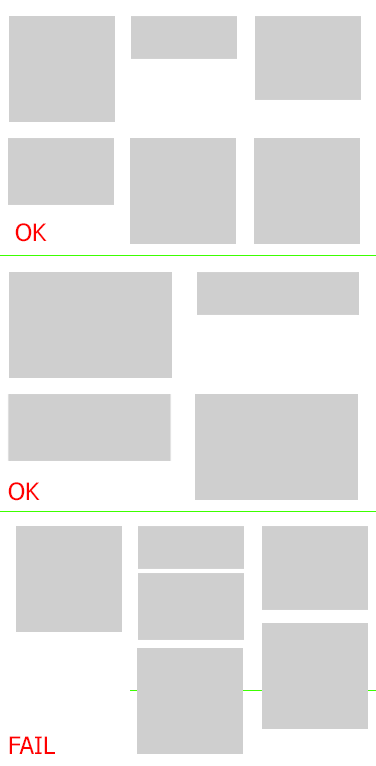
Below an image that illustrates my problem
This seems to me case for flexbox
– Bacco