You could try using the dial :target for elements with Ids combined with the URL HASH, for example:
.spin:target {
animation: spin 3s linear infinite;
}
The code must be something like:
Click on the button below execute and then on the link whole page
body {
color: #fff;
margin: 30px;
}
.original {
background: #d2d2d2;
margin: 10px 15px;
width: 95px;
}
.box {
background: red;
height: 95px;
width: 95px;
line-height: 95px;
text-align: center;
display: block;
transform: rotate(-55deg);
}
.spin {
cursor: pointer;
}
.spin:target {
animation: spin 3s linear infinite;
}
@keyframes spin {
0% {
transform: rotateY(0deg);
}
100% {
transform: rotateY(360deg);
}
}
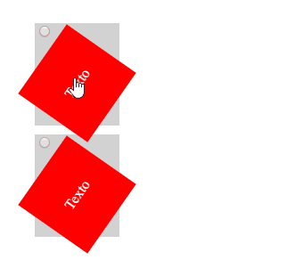
<div class="original">
<div class="spin" id="elemento1">
<a class="box" href="#elemento1">Texto</a>
</div>
</div>
<div class="original">
<div class="spin" id="elemento2">
<a class="box" href="#elemento2">Texto</a>
</div>
</div>
But ai complicates, because it depends on the hash in the url to animate, as:
http://site.com/pagina.html#elemento1
http://site.com/pagina.html#elemento2
So if the hash is more of a problem than a solution for you, just using javascript in with a class for this. In CSS it should look like this:
.spin.animar {
animation: spin 3s linear infinite;
}
The whole code can be something like (read the comments to understand the code):
//Detecta quando a página já foi carregada (menos os recursos externos)
window.addEventListener('DOMContentLoaded', function () {
//Pega todos elementos com a classe spin
var els = document.querySelectorAll('.spin');
//Itera todos elementos
for (var i = els.length - 1; i >= 0; i--) {
//Aplica o evento onclick
els[i].onclick = animarElement;
}
});
function animarElement()
{
var els = document.querySelectorAll('.spin');
for (var i = els.length - 1; i >= 0; i--) {
var el = els[i];
//Remove a classe CSS animar de todos elementos, menos o elemento clicado (se já tiver a classe nele)
if (el !== this && el.classList.contains('animar')) {
el.classList.remove('animar');
}
}
//Se o elemento clicado não tiver a classe animar ainda então aplicamos ela
if (!this.classList.contains('animar')) {
this.classList.add('animar');
}
}
body {
color: #fff;
margin: 30px;
}
.original {
background: #d2d2d2;
margin: 10px 15px;
width: 95px;
}
.box {
background: red;
height: 95px;
width: 95px;
line-height: 95px;
text-align: center;
display: block;
transform: rotate(-55deg);
}
.spin {
cursor: pointer;
}
.spin.animar {
animation: spin 3s linear infinite;
}
@keyframes spin {
0% {
transform: rotateY(0deg);
}
100% {
transform: rotateY(360deg);
}
}
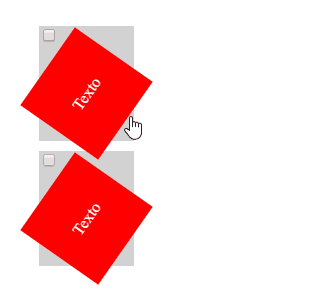
<div class="original">
<div class="spin">
<div class="box">Texto</div>
</div>
</div>
<div class="original">
<div class="spin">
<div class="box">Texto</div>
</div>
</div>
Note that the use of :active, :focus and similar work only with elements "clickable" or "focusable", Divs won’t stand for this, so do this:
.spin:active {
    animation: spin 3s linear infinite;
}
For Divs elements will not work.
Following are some examples of them are the elements that support the :active:
<a href=""></a> (shall contain the attribute href=)<button></button>- And the elements associated with a
<label></label>